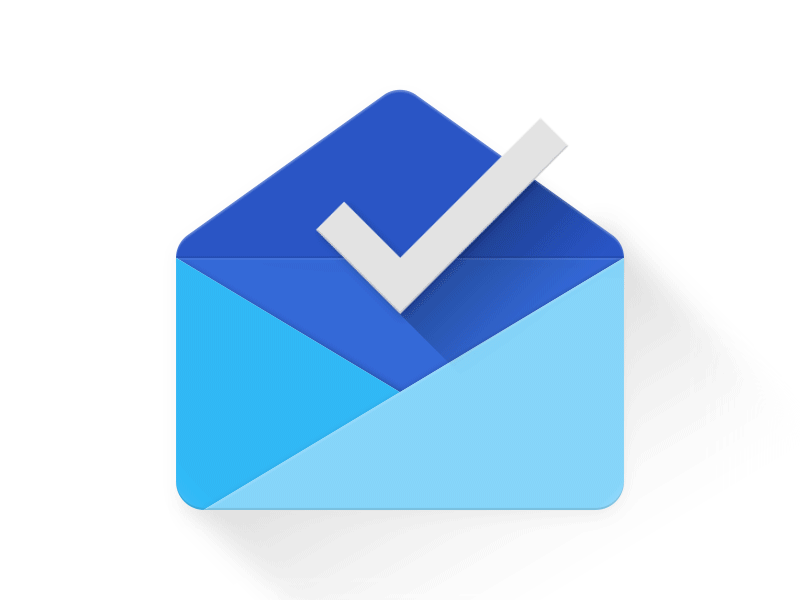
Inbox App Icon
The app icon design process was a collaborative effort. Early concepts were contributed by the Google Material Design team, Inbox design team and creative agency B-Reel.

The design process included several sprints with Inbox UX, B-Reel in NY, and we iterated through more than 250 adaptations. Once the preferred concept was decided upon, the final design was a collaboration between myself and Jesse Kaczmarek (Google's Material Design Team Iconographer), who helped tweak its proportions and shadowing to fit seamlessly into the larger Google ecosystem.
A small sample of the design iterations
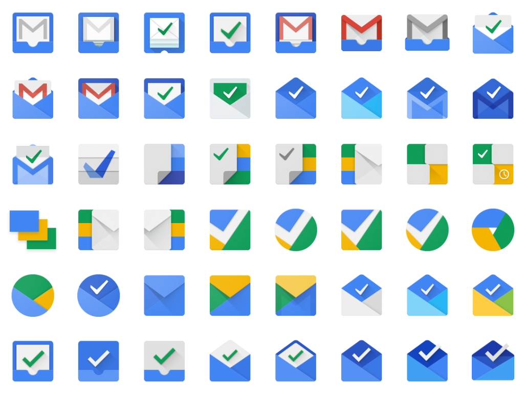
The concept development began months before the name Inbox was chosen for the product, so many early iterations focused on its relationship to Gmail; other options aimed to highlight the key features of the app.
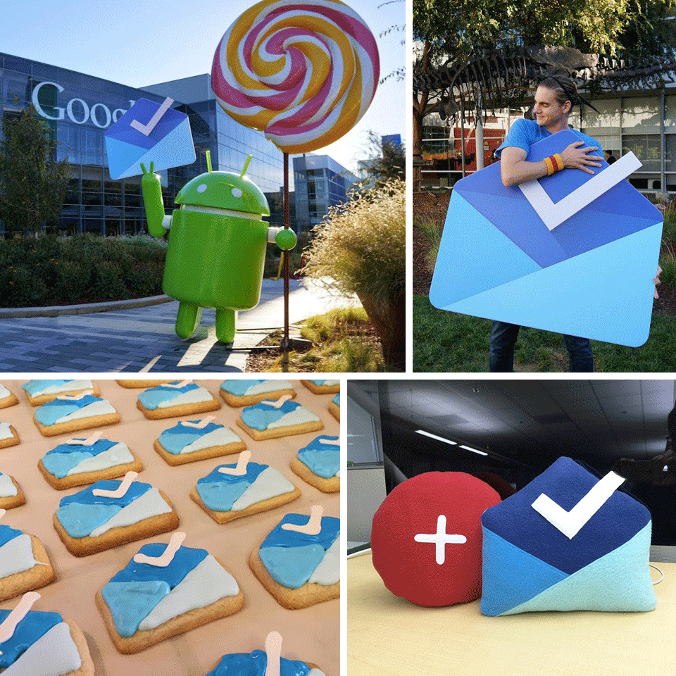
Other applications of the Icon
Animation by John Schlemmer