Family Crest
An ongoing personal project to create a visual identity that marries (pun intended) the heritage of two family names, and reinforces the personality and principles of the union.

Making the mark
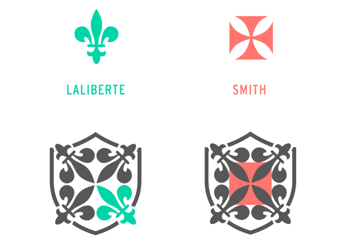
The mark was created by iterating on combinations of the English Cross and Fleur de lis. After a lot of noodling around I discovered that by repeating and rotating the tip of the fluer de lis, a fairly good representation of the cross was formed in the negative space.
The colour palette
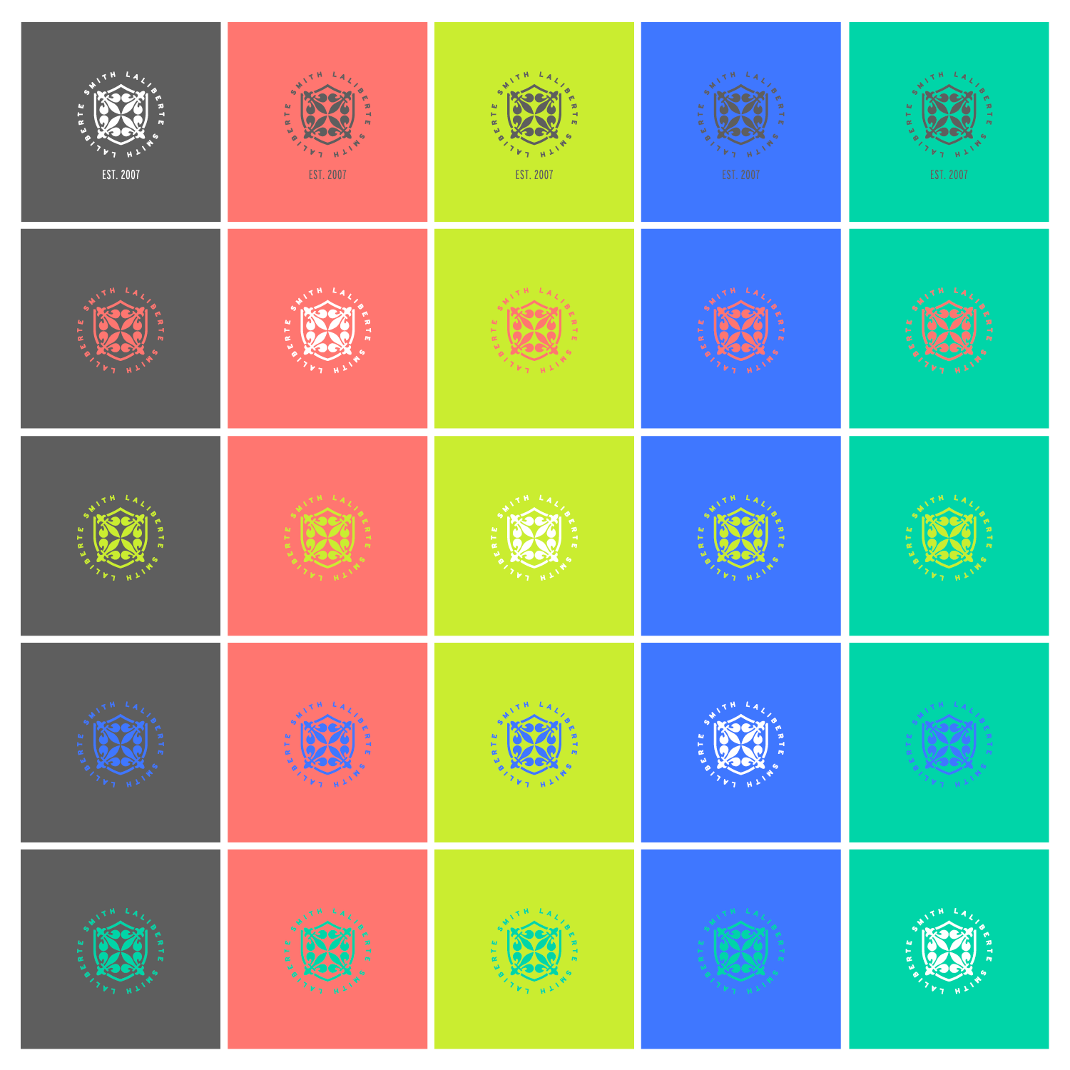
Historically, crest colors tended towards deep reds, blues and blacks with the occasional gold and purple accent; but since my goal was to make a visual system that represents who we are today, I selected vibrant, bold colors and a neutral dark grey.
The voice for the family is witty, charming, and occasionally thoughful.
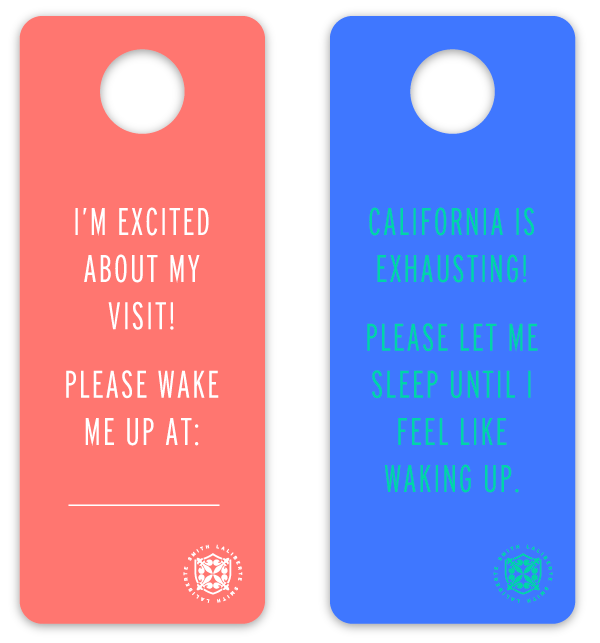
Hangtags for visiting guests
Family announcements

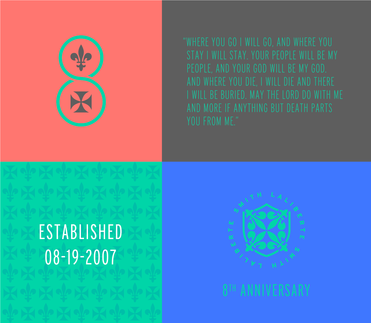
8th anniversary celebration
Roundel
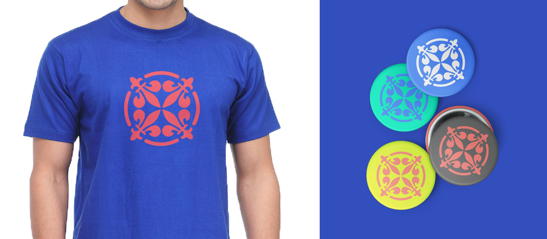
To make sure the mark was scalable, I also created a simpler 'roundel' version with a circular frame and no text. This works really well when used in smaller applications, or as a graphic element rather than a brand mark.

Roundel applications
